Browse By Unit
ACT Math: Essential Skills: Data Analysis & Representations 📈
7 min read•june 18, 2024
pooja mathur
Sameeha
pooja mathur
Sameeha
In this ACT Math section, we take a break from standard algebra and geometry and head into the wondrous world of data! By the end of this study guide, you’ll be able to create and interpret different types of models 📊 that will help you predict how different pieces of information relate to each other.
📈 ACT Math: Data Analysis & Representations

These types of problems are found throughout the ACT Math section. The majority of these topics are a part of statistics, but some may also show up in the algebra section! They are part of Integrating Essential Skills, which make up about 40-43% of the exam. For a detailed overview of the ACT as a whole, check out this article.
📤 Distribution Measures
🎯 Measures of Center
There are many ways to describe a data set. Measures of center help describe individual values within the data set, such as mean, median, and mode.
The mean refers to the average of a data set.
The median is the middle value of a data set when it is lined up from least to greatest value.
The mode is the number that occurs the most often in a data set.
Need a refresher on how to find these values? Take a look at our Stats & Probability study guide!
Example
The average of five different test scores has the same value as the median of the five scores. The sum of the five test scores is 465. What is the sum of the six scores that are NOT the median?
In this problem, we will first find the average of the test scores: 465/5 = 93. The mean and median are the same, so the median is also 93. Since the scores are all distinct, the median value does not repeat anywhere in the data set. Thus, the sum of the 6 other scores is 530 - 93 = 437.
🍞 Measures of Spread
Measures of spread describe the data's variation and/or distribution within the set, such as range and standard deviation.
The standard deviation is the mean distance between the mean of the data set and a single data point. The greater the standard deviation, the larger the spread of data will be since the datapoint will be further from the mean.
The range is the positive difference between the lowest and high value in a data set. Data sets with greater ranges tend to have larger variability.
You will likely be asked to find these values (except standard deviation) from a single data set or compare them between multiple data sets.
Example
The prices of candy in a shop differ depending on the type. Chocolate bars cost 5, and lollipops cost $2. What is the range for the price of candy in the shop?
In this problem, we must begin by identifying the lowest and highest value in the data set. The lollipops are the lowest value at 5. To find the range, subtract the lowest value from the greatest.
2 = 3.
🛎️ Normal Distribution
The Normal Distribution is a special kind of distribution. The data is centered with no left or right skew and shaped like a “bell curve” 🔔
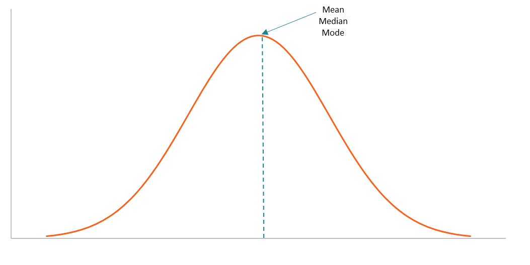
Image Courtesy of Corporate Finance Institute
The mean, median, and mode are all the same in a normal distribution, making the distribution symmetrical.
Standard Deviation within the Normal Distribution
In a normal distribution, the standard deviations follow a pattern known as 68-95-99:
- 68% of values in the data set are 1️⃣ standard deviation from the mean.
- 95% of the values in the data set are 2️⃣ standard deviations from the mean.
- 99.7% of the values in the data set are 3️⃣ standard deviations from the mean. This information is helpful to help understand where a data value is located within the distribution!
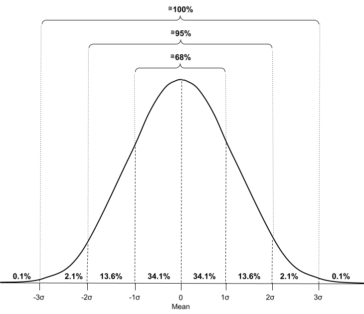
Image from The Science of Machine Learning
The simplest and most common form is simple linear regression, in which a linear equation 📈 can be created from a data set. On the ACT, this will most likely be used to predict future data values.
-----
👋 Associations between two variables
🤝 Correlation
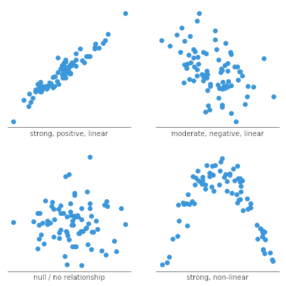
Association, most commonly indicated by the word correlation, can help us find how two variables relate to each other. Although finding the correlation values may be a bit advanced for the ACT, you might be asked to look at a graph or a dataset and determine if there is a strong or weak correlation between the two variables.
🌠 Regression
Regression is a method to determine the equation that “best fits” data from 2 variables.
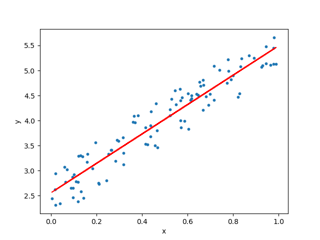
Image from Towards Data Science
If the data doesn’t seem linearly related, another form is quadratic regression, which produces a quadratic equation that “best fits” the presented data.
The fastest and easiest way to perform any regression is on a calculator🖩 If you are uncomfortable with using your calculator, check out these resources!
📋 2-way tables
A 2-way table tells you how many data points fit both categories of variables. Some common examples are gender vs. political affiliation, age, ice-cream flavor, grade level, and mode of transportation to school.
2-way table problems are like fun logic puzzles! Generally, you’re given certain data points and the total number of data points and will have to use arithmetic to find a missing value.
Example
High school upperclassmen are surveyed to determine their favorite subjects: math, history, English, and science. Some results are shown in the two-way frequency table below.
🧪 What percentage of seniors chose science?
| Math | English | Science | History | Total | |
| Juniors | 12 | 55 | 107 | 214 | |
| Seniors | 22 | 16 | 92 | ||
| Total | 62 | 28 | 199 | 398 |
At first glance, you may want to fill out all of the missing information completely. However, the ACT math section is timed! Only fill out the information that you need to get to the answer. To figure out how many seniors chose science, we need to figure out 1 of 2 things: how many people took science in total, or how many seniors there are in total.
Let’s try to solve it with the first method. To find out how many total science-lovers there are, we must add up the other subjects' totals and subtract that from the total students. Then, we’ll subtract the 55 juniors from that number to get the seniors: 398 - (62 + 28+ 199) = 109, 109 - 55 = 54 seniors.
In the second method, we’ll find the total number of seniors by subtracting the total number of juniors from all students. Then, we’ll add up the other subjects for seniors and subtract that from all seniors to get just the ones that like science: 398 - 214 = 184, 184 - (22 + 16 + 92) = 54 seniors!
⚇ Scatter plots
Scatter plots use dots to represent each data point in the set. They will help you determine correlations between two variables depending on their shape and direction and will help you determine if linear regression needs to be done to find a line of best fit!
-----
🤔 Interpreting models
You can create linear models using both linear regression and algebraic manipulation. Graphing linear models can help us determine how useful or representative the linear model actually is! As mentioned previously, accurate models can help us predict values beyond the dataset.
Cross-referencing scatter plot data with the line of best fit will help you determine if a linear model is appropriate ✔️ If the scatter plot seems to have no shape or is trending in a different direction than the linear model, it may not ❌ be the model to use!
-----
🥳 Conclusion
Congrats, you made it to the end of this guide! Knowing how to interpret data will really help you ace the ACT data problems. Make sure to use the tips and tricks you learned here in your future problems. Happy solving!
Need more ACT practice?
Fiveable has you covered! Check out all the resources that cover all you need to know about each ACT Subject including the ACT essay. With consistent practice, you'll be ready to do your best on the ACT!
For more ACT prep guides, visit the ACT subject page here. You can do this! Fiveable is rooting for your ACT success! 🎉
<< Hide Menu
ACT Math: Essential Skills: Data Analysis & Representations 📈
7 min read•june 18, 2024
pooja mathur
Sameeha
pooja mathur
Sameeha
In this ACT Math section, we take a break from standard algebra and geometry and head into the wondrous world of data! By the end of this study guide, you’ll be able to create and interpret different types of models 📊 that will help you predict how different pieces of information relate to each other.
📈 ACT Math: Data Analysis & Representations

These types of problems are found throughout the ACT Math section. The majority of these topics are a part of statistics, but some may also show up in the algebra section! They are part of Integrating Essential Skills, which make up about 40-43% of the exam. For a detailed overview of the ACT as a whole, check out this article.
📤 Distribution Measures
🎯 Measures of Center
There are many ways to describe a data set. Measures of center help describe individual values within the data set, such as mean, median, and mode.
The mean refers to the average of a data set.
The median is the middle value of a data set when it is lined up from least to greatest value.
The mode is the number that occurs the most often in a data set.
Need a refresher on how to find these values? Take a look at our Stats & Probability study guide!
Example
The average of five different test scores has the same value as the median of the five scores. The sum of the five test scores is 465. What is the sum of the six scores that are NOT the median?
In this problem, we will first find the average of the test scores: 465/5 = 93. The mean and median are the same, so the median is also 93. Since the scores are all distinct, the median value does not repeat anywhere in the data set. Thus, the sum of the 6 other scores is 530 - 93 = 437.
🍞 Measures of Spread
Measures of spread describe the data's variation and/or distribution within the set, such as range and standard deviation.
The standard deviation is the mean distance between the mean of the data set and a single data point. The greater the standard deviation, the larger the spread of data will be since the datapoint will be further from the mean.
The range is the positive difference between the lowest and high value in a data set. Data sets with greater ranges tend to have larger variability.
You will likely be asked to find these values (except standard deviation) from a single data set or compare them between multiple data sets.
Example
The prices of candy in a shop differ depending on the type. Chocolate bars cost 5, and lollipops cost $2. What is the range for the price of candy in the shop?
In this problem, we must begin by identifying the lowest and highest value in the data set. The lollipops are the lowest value at 5. To find the range, subtract the lowest value from the greatest.
2 = 3.
🛎️ Normal Distribution
The Normal Distribution is a special kind of distribution. The data is centered with no left or right skew and shaped like a “bell curve” 🔔

Image Courtesy of Corporate Finance Institute
The mean, median, and mode are all the same in a normal distribution, making the distribution symmetrical.
Standard Deviation within the Normal Distribution
In a normal distribution, the standard deviations follow a pattern known as 68-95-99:
- 68% of values in the data set are 1️⃣ standard deviation from the mean.
- 95% of the values in the data set are 2️⃣ standard deviations from the mean.
- 99.7% of the values in the data set are 3️⃣ standard deviations from the mean. This information is helpful to help understand where a data value is located within the distribution!

Image from The Science of Machine Learning
The simplest and most common form is simple linear regression, in which a linear equation 📈 can be created from a data set. On the ACT, this will most likely be used to predict future data values.
-----
👋 Associations between two variables
🤝 Correlation
Association, most commonly indicated by the word correlation, can help us find how two variables relate to each other. Although finding the correlation values may be a bit advanced for the ACT, you might be asked to look at a graph or a dataset and determine if there is a strong or weak correlation between the two variables.
🌠 Regression
Regression is a method to determine the equation that “best fits” data from 2 variables.

Image from Towards Data Science
If the data doesn’t seem linearly related, another form is quadratic regression, which produces a quadratic equation that “best fits” the presented data.
The fastest and easiest way to perform any regression is on a calculator🖩 If you are uncomfortable with using your calculator, check out these resources!
📋 2-way tables
A 2-way table tells you how many data points fit both categories of variables. Some common examples are gender vs. political affiliation, age, ice-cream flavor, grade level, and mode of transportation to school.
2-way table problems are like fun logic puzzles! Generally, you’re given certain data points and the total number of data points and will have to use arithmetic to find a missing value.
Example
High school upperclassmen are surveyed to determine their favorite subjects: math, history, English, and science. Some results are shown in the two-way frequency table below.
🧪 What percentage of seniors chose science?
| Math | English | Science | History | Total | |
| Juniors | 12 | 55 | 107 | 214 | |
| Seniors | 22 | 16 | 92 | ||
| Total | 62 | 28 | 199 | 398 |
At first glance, you may want to fill out all of the missing information completely. However, the ACT math section is timed! Only fill out the information that you need to get to the answer. To figure out how many seniors chose science, we need to figure out 1 of 2 things: how many people took science in total, or how many seniors there are in total.
Let’s try to solve it with the first method. To find out how many total science-lovers there are, we must add up the other subjects' totals and subtract that from the total students. Then, we’ll subtract the 55 juniors from that number to get the seniors: 398 - (62 + 28+ 199) = 109, 109 - 55 = 54 seniors.
In the second method, we’ll find the total number of seniors by subtracting the total number of juniors from all students. Then, we’ll add up the other subjects for seniors and subtract that from all seniors to get just the ones that like science: 398 - 214 = 184, 184 - (22 + 16 + 92) = 54 seniors!
⚇ Scatter plots
Scatter plots use dots to represent each data point in the set. They will help you determine correlations between two variables depending on their shape and direction and will help you determine if linear regression needs to be done to find a line of best fit!
-----
🤔 Interpreting models
You can create linear models using both linear regression and algebraic manipulation. Graphing linear models can help us determine how useful or representative the linear model actually is! As mentioned previously, accurate models can help us predict values beyond the dataset.
Cross-referencing scatter plot data with the line of best fit will help you determine if a linear model is appropriate ✔️ If the scatter plot seems to have no shape or is trending in a different direction than the linear model, it may not ❌ be the model to use!

-----
🥳 Conclusion
Congrats, you made it to the end of this guide! Knowing how to interpret data will really help you ace the ACT data problems. Make sure to use the tips and tricks you learned here in your future problems. Happy solving!
Need more ACT practice?
Fiveable has you covered! Check out all the resources that cover all you need to know about each ACT Subject including the ACT essay. With consistent practice, you'll be ready to do your best on the ACT!
For more ACT prep guides, visit the ACT subject page here. You can do this! Fiveable is rooting for your ACT success! 🎉

© 2025 Fiveable Inc. All rights reserved.