Jeanne Stansak
Jeanne Stansak
In economics, every good or service is sold within a market structure. There are several market structures that we will look at. The four main market structures are perfect competition, monopoly, monopolistic competition, and oligopoly. Market structures are distinctive based on certain characteristics including the number of firms that are in them, barriers to entry and exit, control over price, and whether the goods are identical or differentiated.
Characteristics of Perfect Competition
- Many, small firms in the industry: In perfect competition, there are hundreds or thousands of small firms that all sell identical products.
- Firms are "Price Takers": This means that firms have no control over the price at which they sell their goods in the market. All firms must sell their output at the same price set by supply and demand in the industry. There is no incentive to deviate from the price set by the market. A firm would not want to raise its price because consumers would just buy from one of the many competitive firms that are selling the product at a lower price. A firm would not want to lower their price if they can get a higher price for their product that is set by the market.
- Low barriers to entry: Barriers to entry are obstacles that can make it difficult for new firms to join an industry and compete with other firms. These can include things like geographic location, control over resources, government regulations and protections, technology, common use, and economies of scale. In perfect competition, there are very low barriers of entry so it is very easy for firms to enter or exit as they see fit.
- Firms break even in the long-run: This occurs because of the lack of barriers to entry or exit. Since firms are free to enter or exit in response to potential profit, or lack thereof, they cannot make an economic profit and will only break even. In long-run equilibrium, price is equal to marginal cost and the minimum ATC.
- Products sold are identical: In perfect competition, the various products that are sold are identical. One of the best examples of a perfectly competitive market is the agriculture industry. Think about when you walk into the produce section of a grocery store and purchase an orange. Each orange that is there is identical—there is no way to distinguish which farmer produced each one.
- No non-price competition: Due to the fact that products are identical in perfect competition, there is no need to have non-price competition. One of the best examples of non-price competition is the advertising of your product. Think about this from the standpoint of a farmer that grows oranges. There is no need for him to advertise his product on television because all oranges are identical, and they all sell for the exact same price.
- Firms are perfectly efficient in the long-run: If a firm is inefficient, they will have higher costs and will struggle to maximize their profits. If they do this, they increase their risk of taking losses, and might be forced to leave the industry. In the long-run, perfectly competitive firms are both allocatively and productively efficient.
Side by Side Graphs in Perfect Competition
Perfect competition is the only market structure that has side by side graphs. By having side by side graphs, we are able to show the characteristic of price takers, and we can also show how when something happens in the market there is an impact on the firm.
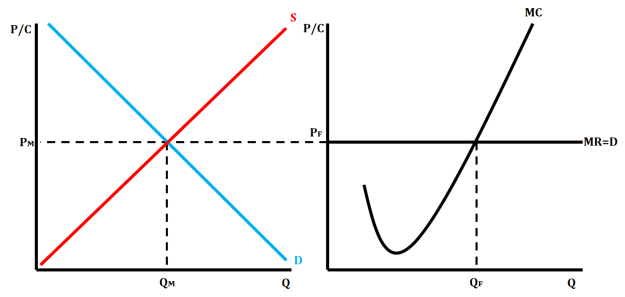
There are some key labels on this graph. Once we begin to draw the various market structure graphs, we use P/C on the vertical axis. This shows that both price and cost can be represented on this axis. On the horizontal axis, we always place the quantity.
The graph on the left-hand side represents the market graph. The market graph is your standard supply and demand graph that we learned about in Unit 2. The graph on the right-hand side represents the graph of an individual firm. In the firm graph, we have a horizontal, or perfectly elastic, price line that also represents marginal revenue (MR) and demand (D). In a perfectly competitive market, since we sell every unit of a good for the same price, our marginal revenue (the additional revenue per unit) is the same as the price. Demand is also represented by that perfectly elastic curve. Since they are price takers, there is no point in changing their prices. If they increased prices, consumers won't buy their product. If they decreased price, consumers are still willing to buy the product at the price set by the market, so they would incur a loss.
Different Types of Short Run Perfectly Competitive Graphs
In a perfectly competitive market in the short-run, a graph can display three possible scenarios. They can show a short-run profit, short-run loss, or short-run shutdown.
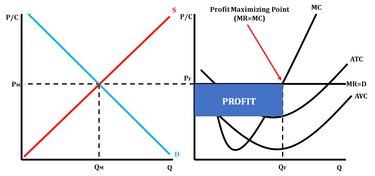
A short-run profit is shown by both the ATC and AVC curve being below the price at the profit-maximizing point MR = MC. The graphs below represent a short-run profit for a perfectly competitive firm.
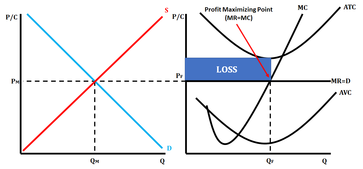
A short-run loss is shown when the ATC is located above the price line at the profit-maximizing point, and the AVC curve is located below the price line at the profit-maximizing point. The graphs below represent a short-run loss for a perfectly competitive firm.
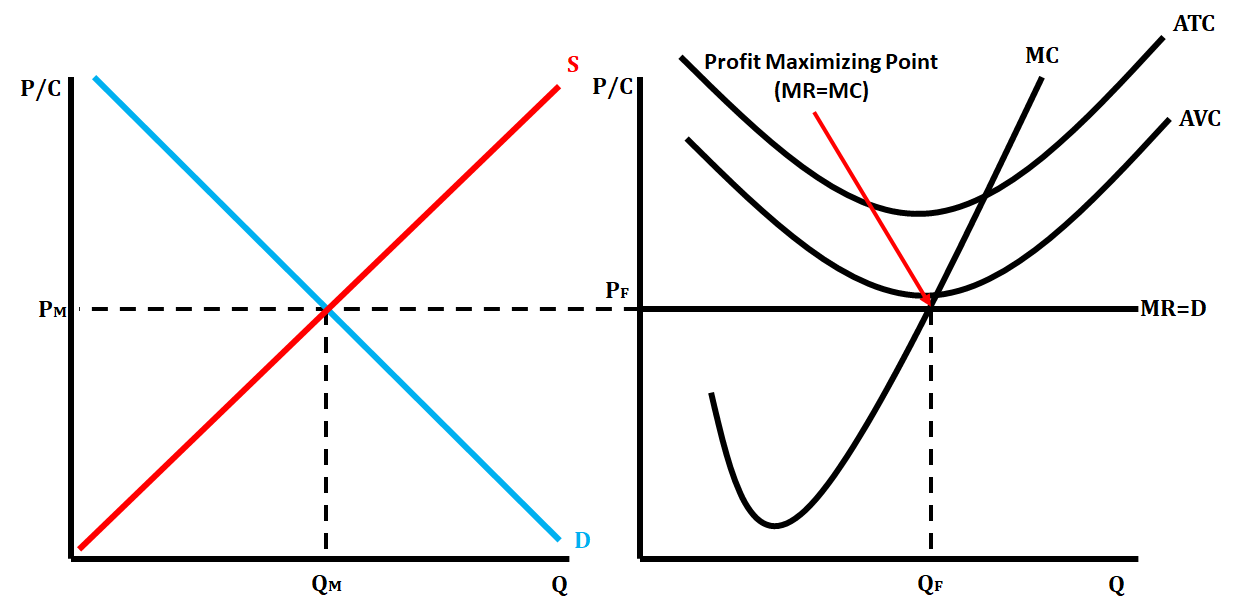
A shutdown is shown with both ATC and AVC located above the price line at the profit-maximizing point. The graphs below represent a shutdown point for a perfectly competitive firm.
Long-Run Perfectly Competitive Graph
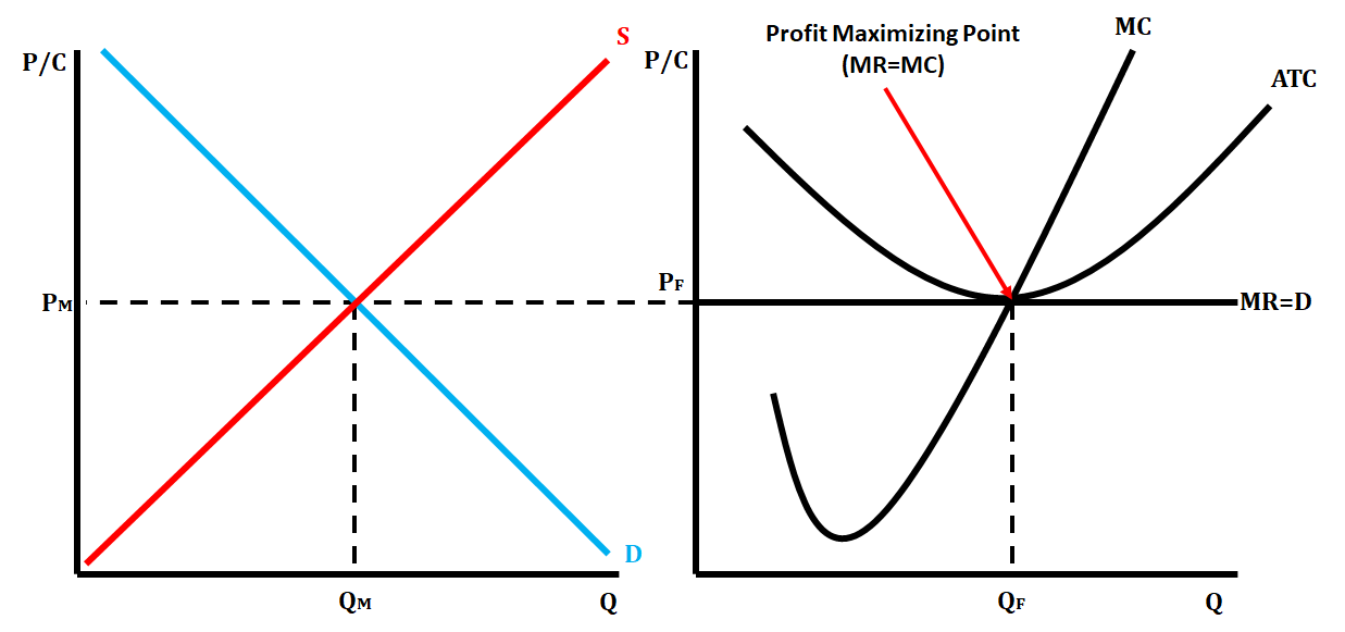
When a perfectly competitive market is in long-run equilibrium, we show this on the side by side graphs by having ATC tangent to the price line at the profit-maximizing quantity (MR = MC). When a perfectly competitive market is in long-run equilibrium, it is both allocatively efficient and productively efficient. On a graph, allocative efficiency is P(MR) = MC, and productive efficiency is P = minimum ATC.
Shift from Short-Run to Long-Run Equilibrium in a Perfectly Competitive Market
When a short-run perfectly competitive market is earning either a profit or loss, firms will want to either enter or exit the market, thus market shifting the market from short-run to long-run.
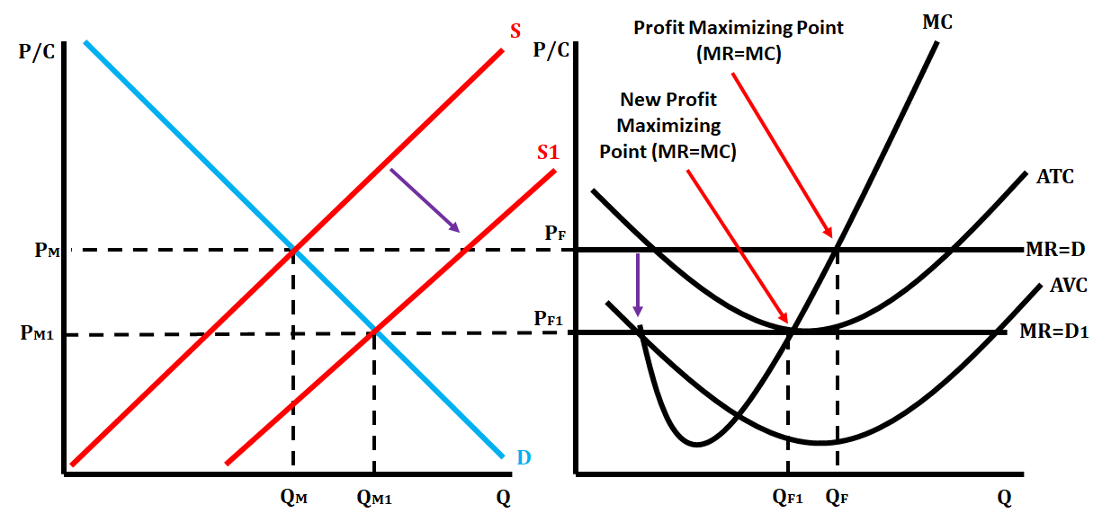
When a firm is earning a profit, this provides an incentive for firms not already in the industry to enter because of the possible profit. This will cause the supply curve to shift right, illustrating the increase in the supply of firms, which will lower the market price and in turn lower the price for each firm.
We illustrate this on the graphs by shifting the price line down to become tangent with ATC. The profit-maximizing quantity for the firm will decrease. The market quantity will increase as there are now more firms in the industry, but each individual firm is supplying less of that overall quantity. The below graphs show how a perfectly competitive market goes from a short-run profit to long-run equilibrium.
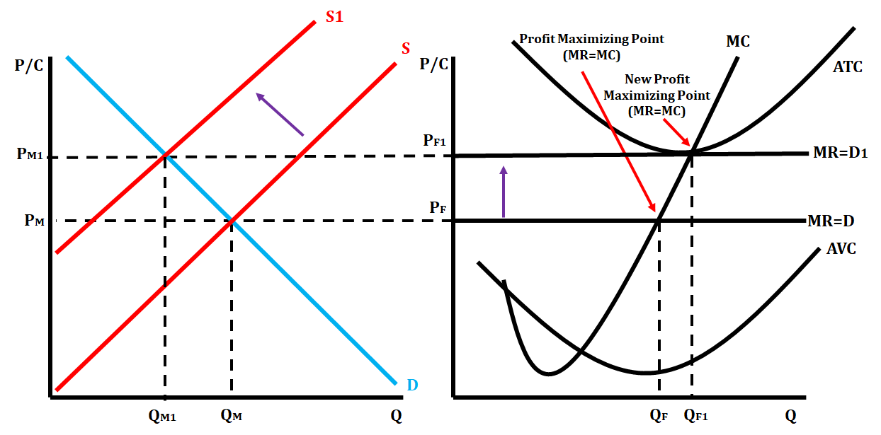
When a firm is earning a loss, this provides an incentive for firms to exit the industry because of the loss of profit. This will cause the supply curve to shift left, illustrating a decrease in the supply of firms which will raise the market price, and in turn, raise the price for each firm.
We illustrate this on the graphs by shifting the price line up to become tangent with ATC. The profit-maximizing quantity for the firm increases. The market quantity decreases, as there are fewer firms providing this particular good, and each individual firm will supply more of the overall quantity. The below graphs show how a perfectly competitive market goes from a short-run loss to long-run equilibrium.
Shift from Long-Run to Short-Run back to Long-Run
Sometimes, you will be given scenarios where you start in long-run equilibrium, and then you are given a situation that changes demand in the market. This shift of demand moves the market into short-run, and then it has to readjust back to long-run as described in the previous section. Let's show how this occurs when there is a scenario that increases demand. We'll use the market for apples.
Step 1: You are told you are beginning in long-run equilibrium. Suddenly, the cost of peaches, which are a substitute for apples, increases. This will cause consumers to want fewer peaches and demand more apples. As a result, the demand curve in the apple market increases (shifts right), and the equilibrium price increases. We show this on the firm graph by shifting the price line up and identifying the new profit-maximizing point for the firm (MR = MC). This causes the firm to go from long-run equilibrium to short-run profit since the price line is above the ATC curve.
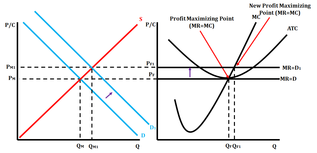
Step 2: Now that the perfectly competitive market is earning a short-run profit, individual firms are incentivized to enter the market. This makes the supply curve shift right, causing the equilibrium price to decrease. This will cause the price line to drop on the firm graph and cause the profit-maximizing quantity to return to the original one in the firm.
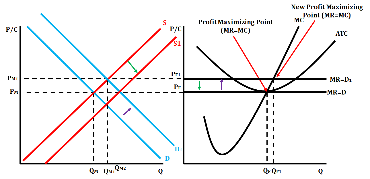
This can happen anytime a perfectly competitive market starts in long-run equilibrium and gets moved to short-run. The market always has to readjust to long-run equilibrium.
<< Hide Menu
Jeanne Stansak
Jeanne Stansak
In economics, every good or service is sold within a market structure. There are several market structures that we will look at. The four main market structures are perfect competition, monopoly, monopolistic competition, and oligopoly. Market structures are distinctive based on certain characteristics including the number of firms that are in them, barriers to entry and exit, control over price, and whether the goods are identical or differentiated.
Characteristics of Perfect Competition
- Many, small firms in the industry: In perfect competition, there are hundreds or thousands of small firms that all sell identical products.
- Firms are "Price Takers": This means that firms have no control over the price at which they sell their goods in the market. All firms must sell their output at the same price set by supply and demand in the industry. There is no incentive to deviate from the price set by the market. A firm would not want to raise its price because consumers would just buy from one of the many competitive firms that are selling the product at a lower price. A firm would not want to lower their price if they can get a higher price for their product that is set by the market.
- Low barriers to entry: Barriers to entry are obstacles that can make it difficult for new firms to join an industry and compete with other firms. These can include things like geographic location, control over resources, government regulations and protections, technology, common use, and economies of scale. In perfect competition, there are very low barriers of entry so it is very easy for firms to enter or exit as they see fit.
- Firms break even in the long-run: This occurs because of the lack of barriers to entry or exit. Since firms are free to enter or exit in response to potential profit, or lack thereof, they cannot make an economic profit and will only break even. In long-run equilibrium, price is equal to marginal cost and the minimum ATC.
- Products sold are identical: In perfect competition, the various products that are sold are identical. One of the best examples of a perfectly competitive market is the agriculture industry. Think about when you walk into the produce section of a grocery store and purchase an orange. Each orange that is there is identical—there is no way to distinguish which farmer produced each one.
- No non-price competition: Due to the fact that products are identical in perfect competition, there is no need to have non-price competition. One of the best examples of non-price competition is the advertising of your product. Think about this from the standpoint of a farmer that grows oranges. There is no need for him to advertise his product on television because all oranges are identical, and they all sell for the exact same price.
- Firms are perfectly efficient in the long-run: If a firm is inefficient, they will have higher costs and will struggle to maximize their profits. If they do this, they increase their risk of taking losses, and might be forced to leave the industry. In the long-run, perfectly competitive firms are both allocatively and productively efficient.
Side by Side Graphs in Perfect Competition
Perfect competition is the only market structure that has side by side graphs. By having side by side graphs, we are able to show the characteristic of price takers, and we can also show how when something happens in the market there is an impact on the firm.

There are some key labels on this graph. Once we begin to draw the various market structure graphs, we use P/C on the vertical axis. This shows that both price and cost can be represented on this axis. On the horizontal axis, we always place the quantity.
The graph on the left-hand side represents the market graph. The market graph is your standard supply and demand graph that we learned about in Unit 2. The graph on the right-hand side represents the graph of an individual firm. In the firm graph, we have a horizontal, or perfectly elastic, price line that also represents marginal revenue (MR) and demand (D). In a perfectly competitive market, since we sell every unit of a good for the same price, our marginal revenue (the additional revenue per unit) is the same as the price. Demand is also represented by that perfectly elastic curve. Since they are price takers, there is no point in changing their prices. If they increased prices, consumers won't buy their product. If they decreased price, consumers are still willing to buy the product at the price set by the market, so they would incur a loss.
Different Types of Short Run Perfectly Competitive Graphs
In a perfectly competitive market in the short-run, a graph can display three possible scenarios. They can show a short-run profit, short-run loss, or short-run shutdown.
A short-run profit is shown by both the ATC and AVC curve being below the price at the profit-maximizing point MR = MC. The graphs below represent a short-run profit for a perfectly competitive firm.

A short-run loss is shown when the ATC is located above the price line at the profit-maximizing point, and the AVC curve is located below the price line at the profit-maximizing point. The graphs below represent a short-run loss for a perfectly competitive firm.

A shutdown is shown with both ATC and AVC located above the price line at the profit-maximizing point. The graphs below represent a shutdown point for a perfectly competitive firm.

Long-Run Perfectly Competitive Graph
When a perfectly competitive market is in long-run equilibrium, we show this on the side by side graphs by having ATC tangent to the price line at the profit-maximizing quantity (MR = MC). When a perfectly competitive market is in long-run equilibrium, it is both allocatively efficient and productively efficient. On a graph, allocative efficiency is P(MR) = MC, and productive efficiency is P = minimum ATC.

Shift from Short-Run to Long-Run Equilibrium in a Perfectly Competitive Market
When a short-run perfectly competitive market is earning either a profit or loss, firms will want to either enter or exit the market, thus market shifting the market from short-run to long-run.
When a firm is earning a profit, this provides an incentive for firms not already in the industry to enter because of the possible profit. This will cause the supply curve to shift right, illustrating the increase in the supply of firms, which will lower the market price and in turn lower the price for each firm.
We illustrate this on the graphs by shifting the price line down to become tangent with ATC. The profit-maximizing quantity for the firm will decrease. The market quantity will increase as there are now more firms in the industry, but each individual firm is supplying less of that overall quantity. The below graphs show how a perfectly competitive market goes from a short-run profit to long-run equilibrium.

When a firm is earning a loss, this provides an incentive for firms to exit the industry because of the loss of profit. This will cause the supply curve to shift left, illustrating a decrease in the supply of firms which will raise the market price, and in turn, raise the price for each firm.
We illustrate this on the graphs by shifting the price line up to become tangent with ATC. The profit-maximizing quantity for the firm increases. The market quantity decreases, as there are fewer firms providing this particular good, and each individual firm will supply more of the overall quantity. The below graphs show how a perfectly competitive market goes from a short-run loss to long-run equilibrium.

Shift from Long-Run to Short-Run back to Long-Run
Sometimes, you will be given scenarios where you start in long-run equilibrium, and then you are given a situation that changes demand in the market. This shift of demand moves the market into short-run, and then it has to readjust back to long-run as described in the previous section. Let's show how this occurs when there is a scenario that increases demand. We'll use the market for apples.
Step 1: You are told you are beginning in long-run equilibrium. Suddenly, the cost of peaches, which are a substitute for apples, increases. This will cause consumers to want fewer peaches and demand more apples. As a result, the demand curve in the apple market increases (shifts right), and the equilibrium price increases. We show this on the firm graph by shifting the price line up and identifying the new profit-maximizing point for the firm (MR = MC). This causes the firm to go from long-run equilibrium to short-run profit since the price line is above the ATC curve.

Step 2: Now that the perfectly competitive market is earning a short-run profit, individual firms are incentivized to enter the market. This makes the supply curve shift right, causing the equilibrium price to decrease. This will cause the price line to drop on the firm graph and cause the profit-maximizing quantity to return to the original one in the firm.

This can happen anytime a perfectly competitive market starts in long-run equilibrium and gets moved to short-run. The market always has to readjust to long-run equilibrium.

© 2024 Fiveable Inc. All rights reserved.